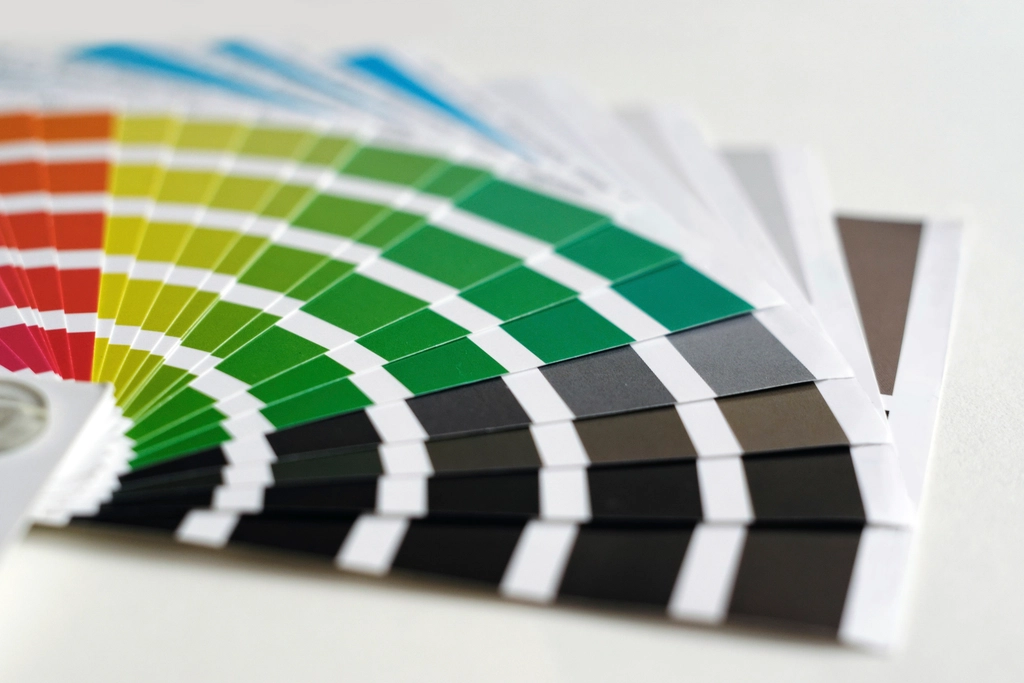
People often start a branding conversation with colour.
“I think we should be green.”
“I hate orange.”
“My competitor is blue, so not blue.”
All valid. Colour is personal. It’s also one of the fastest ways people read who you are, sometimes before they read a single word.
So it deserves a bit more than a favourite.
Start with a feeling
Before picking any colour, I ask: how should people feel when they meet you?
Calm? Energized? Taken care of? Curious?
Write down three words. Not colours. Feelings.
Then we look for colours that carry those feelings. Not because colours have fixed meanings (they don’t, and they change between cultures), but because some combinations simply feel closer to the words than others.
Every palette needs roles
A palette is not a list of colours you like. It’s a team. Each colour has a job.
- A lead colour. The one people remember. Used with confidence, but not everywhere.
- A dark neutral. For text. Easy to read, never pure black if you can avoid it.
- A light neutral. The background. The paper your brand is printed on.
- A supporting colour. For contrast, links, highlights, the occasional surprise.
In my own brand, the lead is a strong pink, supported by deep ink, warm paper and a confident blue. The pink is loud. It’s supposed to be. But it works because the others give it room to breathe.
Check the boring stuff
This is where design meets responsibility.
Can people read text in your colours? On a phone? In sunlight? With low vision?
Contrast checkers are free and simple. A beautiful palette that people can’t read isn’t beautiful. It’s just decoration.
A good palette looks great on a poster. A great palette also works on a receipt.
Test it in real life
Put the colours on a business card mock-up, a website header, an Instagram post, a storefront sign.
Some colours look amazing on screen and strange on paper. Some feel bold in isolation and loud next to your products.
Real life is the final judge.
Then, commit
The biggest mistake isn’t choosing the “wrong” colour. It’s changing it every few months.
Recognition comes from repetition. Choose with care, then give your colours time to become yours.